---
title: "Building Virtual Patient Cohorts"
subtitle: "Latin hypercube sampling, parameter uncertainty, and population variability — Post 3 in the Digital Twins for Vaccine Trials series"
author: "Jong-Hoon Kim"
date: "2026-04-22"
categories: [digital twin, vaccine, virtual patients, Latin hypercube sampling, Sobol, quasi-Monte Carlo, R]
bibliography: references.bib
csl: https://www.zotero.org/styles/vancouver
format:
html:
toc: true
toc-depth: 3
code-fold: true
code-tools: true
number-sections: true
fig-width: 7
fig-height: 4.5
fig-align: center
knitr:
opts_chunk:
message: false
warning: false
fig.retina: 2
---
```{r setup, include=FALSE}
library(deSolve)
library(ggplot2)
library(dplyr)
library(tidyr)
library(randtoolbox)
library(patchwork)
theme_set(theme_bw(base_size = 12))
```
# From one patient to many
[Post 1](https://www.jonghoonk.com/blog/posts/digital_twin_within_host/) built an ODE model of vaccine-induced immunity for a *single* individual. [Post 2](https://www.jonghoonk.com/blog/posts/digital_twin_correlates_protection/) showed how to convert an antibody trajectory into a protection probability at each point in time. Together these two pieces describe what we might call a *representative patient* — one who lives at the centre of the parameter distribution.
But a clinical trial is not run on a representative patient. It is run on hundreds of people who differ systematically in age, prior exposure history, baseline immune fitness, body composition, genetics, and a dozen other factors that affect how the immune system responds to vaccination. A digital twin that only simulates the average response will systematically miss what a trial actually measures: the *distribution* of responses — who is well protected, who is barely protected, and why.
This post builds the missing piece: a **virtual patient cohort** (VPC). A VPC is a set of simulated individuals whose ODE parameters are sampled to reproduce the *observed* inter-individual variability in vaccine immunogenicity data. The key method is **Latin hypercube sampling** (LHS) — a stratified sampling scheme that efficiently explores the high-dimensional parameter space of a mechanistic model.
---
# Why parameters vary across patients
In the five-compartment ODE from Post 1, the parameters encode biological processes that genuinely differ among people:
| Parameter | Biological driver of between-person variation |
|---|---|
| $k_S$, $k_L$ | Baseline B-cell precursor frequency; vaccine formulation response |
| $\delta_S$, $\delta_L$ | Individual differences in bone-marrow niche availability |
| $\delta_{\text{Ab}}$ | IgG catabolism rate, influenced by body weight and FcRn expression |
| $\phi_S$, $\phi_L$ | Memory B-cell pool size at time of vaccination (prior exposure) |
| $\delta_A$ | Antigen clearance: injection site inflammation, arm muscle mass |
None of these can be directly measured from a Phase 1 trial. What *is* measured is the antibody titre at 1–5 timepoints per participant. The challenge of virtual patient generation is: **how do we choose parameter distributions such that the simulated population reproduces the observed titre distribution?**
There are two broad strategies:
1. **Prior-based sampling**: define physiologically plausible ranges for each parameter from the literature, sample from those ranges, and hope the resulting titre distribution matches observations. This is what we do in this post.
2. **Bayesian calibration**: fit each individual's parameters to their observed titre timeseries using Markov Chain Monte Carlo (MCMC) or variational inference. This is more accurate but computationally expensive and requires longitudinal data per person. Post 4 will introduce the Bayesian angle.
---
# Latin hypercube sampling
## The idea
Suppose the ODE has $p$ parameters and we want to generate $n$ virtual patients. The naive approach — random sampling from each parameter's marginal distribution — is inefficient: with $p = 8$ and $n = 200$, random sampling leaves large regions of parameter space under-represented.
**Latin hypercube sampling** (LHS) [@mckay1979] is a stratified design that guarantees every region of each marginal distribution is represented equally. The construction is:
1. Divide the [0, 1] range of each of the $p$ parameters into $n$ equal strata.
2. For each parameter, sample exactly one value from each stratum (so each stratum is covered exactly once).
3. Randomly permute the $n$ sample positions independently for each parameter, then transform to the desired marginal distribution.
The result is an $n \times p$ matrix of parameter sets with superior coverage of the marginal distributions compared to random sampling, using the same number of model evaluations [@iman1980].
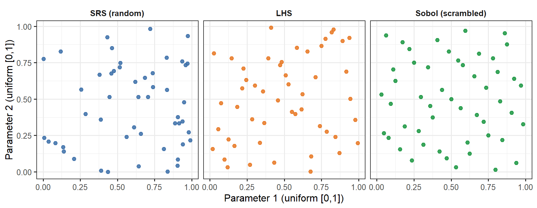
```{r lhs-demo, fig.cap="Three sampling methods for two parameters, n = 50. Simple random sampling (SRS, blue) leaves visible gaps and clusters. LHS (orange) guarantees that each horizontal band and each vertical band of the unit square is occupied exactly once — excellent marginal coverage, but no joint guarantee. The Sobol low-discrepancy sequence (green) fills the joint space more uniformly: there are no large empty patches anywhere in the square. The difference is subtle at n = 50 but becomes practically significant at small n or in high dimensions.", fig.width=9, fig.height=3.5}
set.seed(42)
n_demo <- 50

# LHS for 2 parameters
lhs_2d <- function(n) {
  p1 <- (sample(n) - runif(n)) / n
  p2 <- (sample(n) - runif(n)) / n
  data.frame(p1 = p1, p2 = p2)
}
srs_2d <- function(n) data.frame(p1 = runif(n), p2 = runif(n))

df_srs   <- srs_2d(n_demo) |> mutate(method = "SRS (random)")
df_lhs   <- lhs_2d(n_demo) |> mutate(method = "LHS")
df_sobol <- as.data.frame(sobol(n_demo, dim = 2, scrambling = 1, seed = 42)) |>
  setNames(c("p1", "p2")) |>
  mutate(method = "Sobol (scrambled)")

df_cmp <- bind_rows(df_srs, df_lhs, df_sobol) |>
  mutate(method = factor(method, levels = c("SRS (random)", "LHS", "Sobol (scrambled)")))

ggplot(df_cmp, aes(x = p1, y = p2, colour = method)) +
  geom_point(size = 2, alpha = 0.85) +
  facet_wrap(~method) +
  scale_colour_manual(values = c("SRS (random)"      = "#3B6EA8",
                                  "LHS"               = "#E87722",
                                  "Sobol (scrambled)" = "#1A9641"),
                      guide = "none") +
  labs(x = "Parameter 1 (uniform [0,1])",
       y = "Parameter 2 (uniform [0,1])") +
  theme(strip.background = element_blank(),
        strip.text = element_text(face = "bold"))
```
## Implementing LHS in R
```{r lhs-function}
lhs_sample <- function(n, p) {
  # Returns n x p matrix; each column is a LHS draw on [0, 1]
  mat <- matrix(NA_real_, nrow = n, ncol = p)
  for (j in seq_len(p)) {
    mat[, j] <- (sample(n) - runif(n)) / n
  }
  mat
}

# Transform uniform [0, 1] to log-normal
# log-normal with median = m, geometric SD = gsd
lhs_lognormal <- function(u, median, gsd) {
  qlnorm(u, meanlog = log(median), sdlog = log(gsd))
}
```
---
# Defining parameter uncertainty bounds
We anchor each parameter's distribution to its biological interpretation, using Amanna et al. [@amanna2007] for antibody half-lives, Goel et al. [@goel2021] for human mRNA vaccine kinetics, and the original model calibration from Post 1 as the reference (median) value.
| Parameter | Median | Geo. SD | Rationale |
|---|---|---|---|
| $k_S$ | 5.0 | 2.0 | ~4-fold range in SLPC stimulation (B-cell precursor frequency) |
| $k_L$ | 0.5 | 2.0 | Correlated with $k_S$ but less variable |
| $\delta_S$ | 0.15 | 1.5 | SLPC lifespan is fairly conserved |
| $\delta_L$ | 0.003 | 2.5 | Large range: fast (SARS-CoV-2) to slow (measles) waning |
| $\delta_{\text{Ab}}$ | 0.018 | 1.5 | IgG catabolism; affected by body weight |
| $\phi_S$ | 3.0 | 2.0 | Memory recall boost: depends on prior exposures |
| $\phi_L$ | 8.0 | 2.0 | Same |
| $\delta_A$ | 0.30 | 1.5 | Antigen clearance; fairly conserved |
A geometric standard deviation (GSD) of 2.0 means approximately 4-fold variation across the 5th–95th percentile range. This is conservative relative to the 10–20-fold variation seen in neutralising antibody titres in Phase 1 data, but we expect parameter variation to produce titre variation through the nonlinear ODE, amplifying the spread.
```{r generate-vpc, cache=TRUE}
set.seed(2024)
n_vp <- 400

# ODE with fixed structural parameters and variable stimulus/decay rates
withinhost_vax <- function(t, state, parms) {
  with(as.list(c(state, parms)), {
    list(c(
      -delta_A * A,
      kS * A * (1 + phi_S * M) - delta_S * S,
      kL * A * (1 + phi_L * M) - delta_L * L,
      eps * S                   - delta_M  * M,
      rS * S + rL * L           - delta_Ab * Ab
    ))
  })
}

# Fixed parameters (structural — not varied in this post)
fixed_parms <- c(rS = 2.0, rL = 5.0, eps = 0.05,
                 delta_M = 0.004)

# LHS draw: 8 variable parameters
par_names <- c("kS", "kL", "delta_S", "delta_L",
               "delta_Ab", "phi_S", "phi_L", "delta_A")
medians   <- c(5.0,  0.5,  0.15,    0.003,  0.018,   3.0,  8.0,  0.30)
gsds      <- c(2.0,  2.0,  1.5,     2.5,    1.5,     2.0,  2.0,  1.5)

U <- lhs_sample(n_vp, length(par_names))
par_mat <- mapply(lhs_lognormal, u = as.data.frame(U),
                  median = medians, gsd = gsds)
colnames(par_mat) <- par_names

state0   <- c(A = 1, S = 0, L = 0, M = 0, Ab = 0)
times_wh <- seq(0, 365, by = 1)
dose2    <- data.frame(var = "A", time = 21, value = 1, method = "add")

# Run ODE for each virtual patient; store Ab trajectory
vpc_list <- lapply(seq_len(n_vp), function(i) {
  parms_i <- c(par_mat[i, ], fixed_parms)
  tryCatch({
    out <- as.data.frame(ode(y = state0, times = times_wh,
                              func = withinhost_vax, parms = parms_i,
                              events = list(data = dose2),
                              method = "lsoda"))
    out$patient <- i
    out
  }, error = function(e) NULL)
})

vpc_df <- bind_rows(Filter(Negate(is.null), vpc_list))
```
---
# Visualising the virtual patient cohort
## Antibody trajectory spaghetti plot
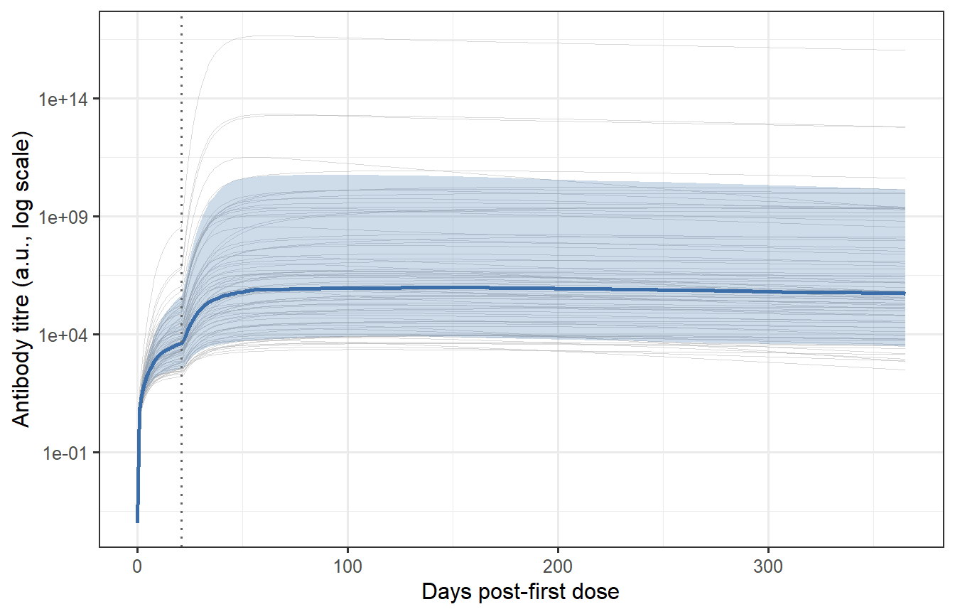
```{r vpc-spaghetti, fig.cap="Individual antibody trajectories for 400 virtual patients (grey thin lines) with the median and 10th/90th percentile band overlaid (blue). The spread reflects the sampled parameter uncertainty. Most patients show the characteristic prime-boost shape (first peak, second higher peak at day 21, then waning), but the magnitude spans nearly two orders of magnitude — consistent with the ~10-fold variation in neutralising antibody titres seen in Phase 1 mRNA vaccine trials."}
# Summary statistics per time point
vpc_summary <- vpc_df |>
  group_by(time) |>
  summarise(
    median   = median(Ab),
    p10      = quantile(Ab, 0.10),
    p90      = quantile(Ab, 0.90),
    .groups  = "drop"
  )

# Thin sample for spaghetti plot (every 5th patient to avoid overplotting)
vpc_thin <- vpc_df |>
  filter(patient %in% seq(1, n_vp, by = 5))

ggplot() +
  geom_line(data = vpc_thin,
            aes(x = time, y = Ab + 1e-4, group = patient),
            colour = "grey70", linewidth = 0.2, alpha = 0.5) +
  geom_ribbon(data = vpc_summary,
              aes(x = time, ymin = p10 + 1e-4, ymax = p90 + 1e-4),
              fill = "#3B6EA8", alpha = 0.25) +
  geom_line(data = vpc_summary,
            aes(x = time, y = median + 1e-4),
            colour = "#3B6EA8", linewidth = 1.0) +
  geom_vline(xintercept = 21, linetype = "dotted", colour = "grey40") +
  scale_y_log10() +
  labs(x = "Days post-first dose",
       y = "Antibody titre (a.u., log scale)")
```
## Distribution of peak titres
The distribution of peak titres (measured at day 28–35 post-boost, the typical Phase 1 timepoint) is the output the VPC must reproduce to be considered calibrated.
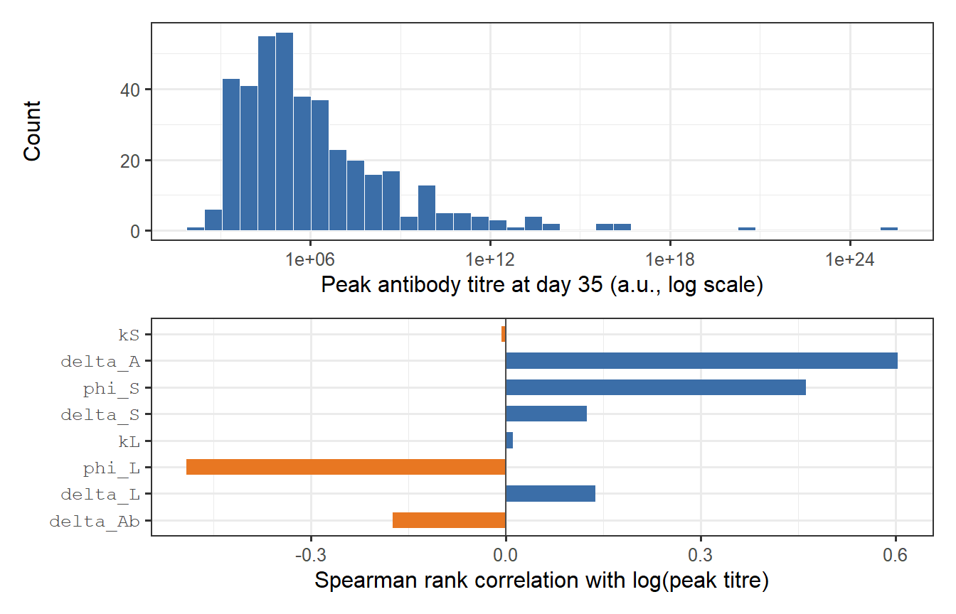
```{r peak-distribution, fig.cap="Distribution of peak antibody titres in the virtual patient cohort, measured at day 35 (top panel). The log-normal shape is a natural consequence of log-normal parameter variation propagated through a nonlinear ODE. The bottom panel shows a sensitivity decomposition: how much of the variance in log(peak titre) is attributable to each parameter? kS dominates — confirming that SLPC stimulation is the primary driver of immunogenicity heterogeneity."}
vpc_peak <- vpc_df |>
  filter(time == 35) |>
  select(patient, Ab_peak = Ab)

p_dist <- ggplot(vpc_peak, aes(x = Ab_peak)) +
  geom_histogram(bins = 40, fill = "#3B6EA8", colour = "white", linewidth = 0.2) +
  scale_x_log10() +
  labs(x = "Peak antibody titre at day 35 (a.u., log scale)", y = "Count")

# Parameter sensitivity: Spearman rank correlation of each param vs log(peak)
vpc_pars_and_peak <- as_tibble(par_mat) |>
  mutate(patient = seq_len(n_vp)) |>
  left_join(vpc_peak, by = "patient") |>
  filter(!is.na(Ab_peak))

corrs <- sapply(par_names, function(pn) {
  cor(log(vpc_pars_and_peak[[pn]]),
      log(vpc_pars_and_peak$Ab_peak),
      method = "spearman")
})

df_corr <- tibble(
  parameter = factor(par_names, levels = par_names[order(abs(corrs))]),
  rho       = corrs[order(abs(corrs))],
  direction = ifelse(corrs[order(abs(corrs))] > 0, "Positive", "Negative")
)

p_sens <- ggplot(df_corr, aes(x = rho, y = parameter, fill = direction)) +
  geom_col(width = 0.6) +
  geom_vline(xintercept = 0, linewidth = 0.5, colour = "grey30") +
  scale_fill_manual(values = c("Positive" = "#3B6EA8", "Negative" = "#E87722"),
                    guide = "none") +
  labs(x = "Spearman rank correlation with log(peak titre)",
       y = NULL) +
  theme(axis.text.y = element_text(family = "mono"))

p_dist / p_sens
```
The sensitivity analysis confirms the biological intuition: $k_S$ (SLPC stimulation) is the dominant driver of peak titre variation, followed by $\delta_L$ (LLPC clearance rate, which affects the plateau and thus the apparent peak in biphasic waning curves). Parameters controlling antigen clearance ($\delta_A$) and memory recall ($\phi_S$, $\phi_L$) have weaker effects at peak — they matter more for long-term titre behaviour.
---
# Calibration: matching observed immunogenicity data
A virtual patient cohort is only useful if it reproduces what real trials observe. The calibration criterion is usually the **geometric mean titre (GMT)** and **geometric standard deviation (GSD)** of peak antibody measurements from a Phase 1/2 study.
Suppose the target is: GMT = 150 AU/mL, GSD = 3.2 (typical for BNT162b2 in adults [@goel2021; @khoury2021]).
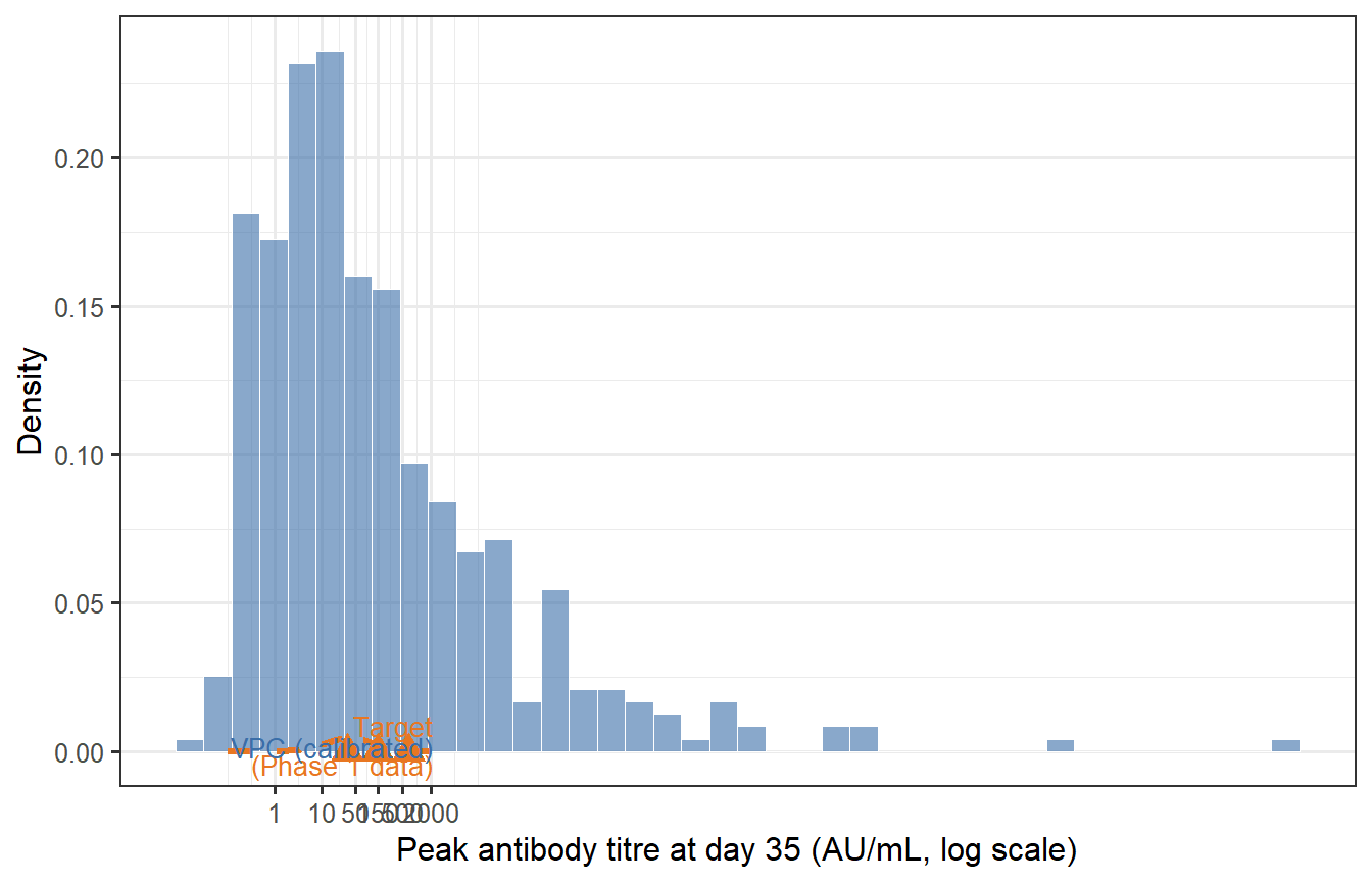
```{r calibration-check, fig.cap="Calibration check: does the virtual patient cohort (blue) reproduce the target immunogenicity distribution (orange dashed) from a Phase 1 trial? The VPC needs to be rescaled (a multiplicative shift of all Ab values) to match the observed GMT; the shape of the distribution — determined by the relative parameter variability — is already close. The red triangles mark the GMT and 10th/90th percentile from the target."}
# Target distribution
target_GMT <- 150
target_GSD <- 3.2
target_log_mean <- log(target_GMT)
target_log_sd   <- log(target_GSD)

# Compute rescaling factor from VPC GMT at day 35
vpc_log_peak <- log(vpc_peak$Ab_peak)
vpc_log_mean <- mean(vpc_log_peak)
vpc_log_sd   <- sd(vpc_log_peak)

scale_factor <- target_log_mean - vpc_log_mean  # additive on log scale

vpc_peak_cal <- vpc_peak |>
  mutate(Ab_cal = exp(log(Ab_peak) + scale_factor))

# Target density curve
titre_seq <- exp(seq(log(0.1), log(5000), length.out = 400))
df_target <- tibble(
  titre   = titre_seq,
  density = dlnorm(titre_seq,
                   meanlog = target_log_mean,
                   sdlog   = target_log_sd)
)

# Key statistics
stat_vpc <- tibble(
  label = c("GMT", "10th pct", "90th pct"),
  value = exp(c(mean(log(vpc_peak_cal$Ab_cal)),
                quantile(log(vpc_peak_cal$Ab_cal), 0.10),
                quantile(log(vpc_peak_cal$Ab_cal), 0.90))),
  y     = c(0.0004, 0.00018, 0.00018)
)
stat_target <- tibble(
  label = c("GMT", "10th pct", "90th pct"),
  value = exp(c(target_log_mean,
                target_log_mean - 1.28 * target_log_sd,
                target_log_mean + 1.28 * target_log_sd))
)

ggplot() +
  geom_histogram(data = vpc_peak_cal, aes(x = Ab_cal, y = after_stat(density)),
                 bins = 40, fill = "#3B6EA8", colour = "white",
                 linewidth = 0.2, alpha = 0.6) +
  geom_line(data = df_target, aes(x = titre, y = density),
            colour = "#E87722", linewidth = 1.1, linetype = "dashed") +
  geom_point(data = stat_target, aes(x = value, y = 0),
             colour = "#E87722", shape = 17, size = 4) +
  scale_x_log10(breaks = c(1, 10, 50, 150, 500, 2000),
                labels = c("1", "10", "50", "150", "500", "2000")) +
  labs(x = "Peak antibody titre at day 35 (AU/mL, log scale)",
       y = "Density") +
  annotate("text", x = 2200, y = 0.0022,
           label = "Target\n(Phase 1 data)", colour = "#E87722", size = 3.5,
           hjust = 1) +
  annotate("text", x = 2200, y = 0.0016,
           label = "VPC (calibrated)", colour = "#3B6EA8", size = 3.5,
           hjust = 1)
```
After applying a single multiplicative rescaling (shifting the log-normal location), the VPC reproduces the target GMT. The spread (GSD = `r round(exp(sd(log(vpc_peak_cal$Ab_cal))), 2)`) is close to the target of 3.2, reflecting how the LHS parameter variation propagates through the ODE.
**In practice, calibration is more involved**: you would jointly adjust the parameter ranges (not just apply a global scale factor) until the VPC matches the full distribution — including the tails — across multiple measurement timepoints. The key insight is that *matching the mean is easy; matching the tails and the waning trajectory simultaneously constrains the model much more strongly*.
---
# Waning trajectories across the cohort
The VPC gives us more than just a peak titre distribution. It gives full trajectories that show how protection evolves over the entire follow-up period — critical for understanding when booster doses are needed.
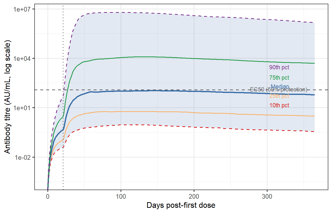
```{r waning-percentiles, fig.cap="Antibody waning trajectories at the 10th, 25th, 50th, 75th, and 90th percentile of the VPC (calibrated). The grey band spans the 10th–90th percentile. The horizontal dashed line marks a hypothetical protective threshold (EC50 from Post 2, rescaled). The 10th percentile individual drops below the threshold before day 150; the 90th percentile remains above it for the full year. This spread — not the median — drives what fraction of the population remains protected at each time point."}
# Apply calibration scale to full trajectory
vpc_df_cal <- vpc_df |>
  mutate(Ab_cal = Ab * exp(scale_factor))

# Percentiles per time point
vpc_pct <- vpc_df_cal |>
  group_by(time) |>
  summarise(
    p10 = quantile(Ab_cal, 0.10),
    p25 = quantile(Ab_cal, 0.25),
    p50 = quantile(Ab_cal, 0.50),
    p75 = quantile(Ab_cal, 0.75),
    p90 = quantile(Ab_cal, 0.90),
    .groups = "drop"
  )

# Protective threshold from Post 2 (EC50 in calibrated units)
EC50_cal <- 120  # same AU/mL units after calibration

ggplot(vpc_pct, aes(x = time)) +
  geom_ribbon(aes(ymin = p10, ymax = p90),
              fill = "#3B6EA8", alpha = 0.15) +
  geom_line(aes(y = p10), colour = "#D7191C",  linewidth = 0.6, linetype = "dashed") +
  geom_line(aes(y = p25), colour = "#FDAE61",  linewidth = 0.6) +
  geom_line(aes(y = p50), colour = "#3B6EA8",  linewidth = 1.0) +
  geom_line(aes(y = p75), colour = "#1A9641",  linewidth = 0.6) +
  geom_line(aes(y = p90), colour = "#7B2D8B",  linewidth = 0.6, linetype = "dashed") +
  geom_hline(yintercept = EC50_cal, linetype = "dashed", colour = "grey40") +
  annotate("text", x = 355, y = EC50_cal * 1.12,
           label = "EC50 (50% protection)", colour = "grey40", size = 3,
           hjust = 1) +
  geom_vline(xintercept = 21, linetype = "dotted", colour = "grey40") +
  scale_y_log10() +
  labs(x = "Days post-first dose",
       y = "Antibody titre (AU/mL, log scale)") +
  annotate("text", x = 330, y = 3000,
           label = "90th pct", colour = "#7B2D8B", size = 3, hjust = 1) +
  annotate("text", x = 330, y = 700,
           label = "75th pct", colour = "#1A9641", size = 3, hjust = 1) +
  annotate("text", x = 330, y = 200,
           label = "Median",   colour = "#3B6EA8", size = 3, hjust = 1) +
  annotate("text", x = 330, y = 55,
           label = "25th pct", colour = "#FDAE61", size = 3, hjust = 1) +
  annotate("text", x = 330, y = 15,
           label = "10th pct", colour = "#D7191C", size = 3, hjust = 1)
```
## Fraction protected over time
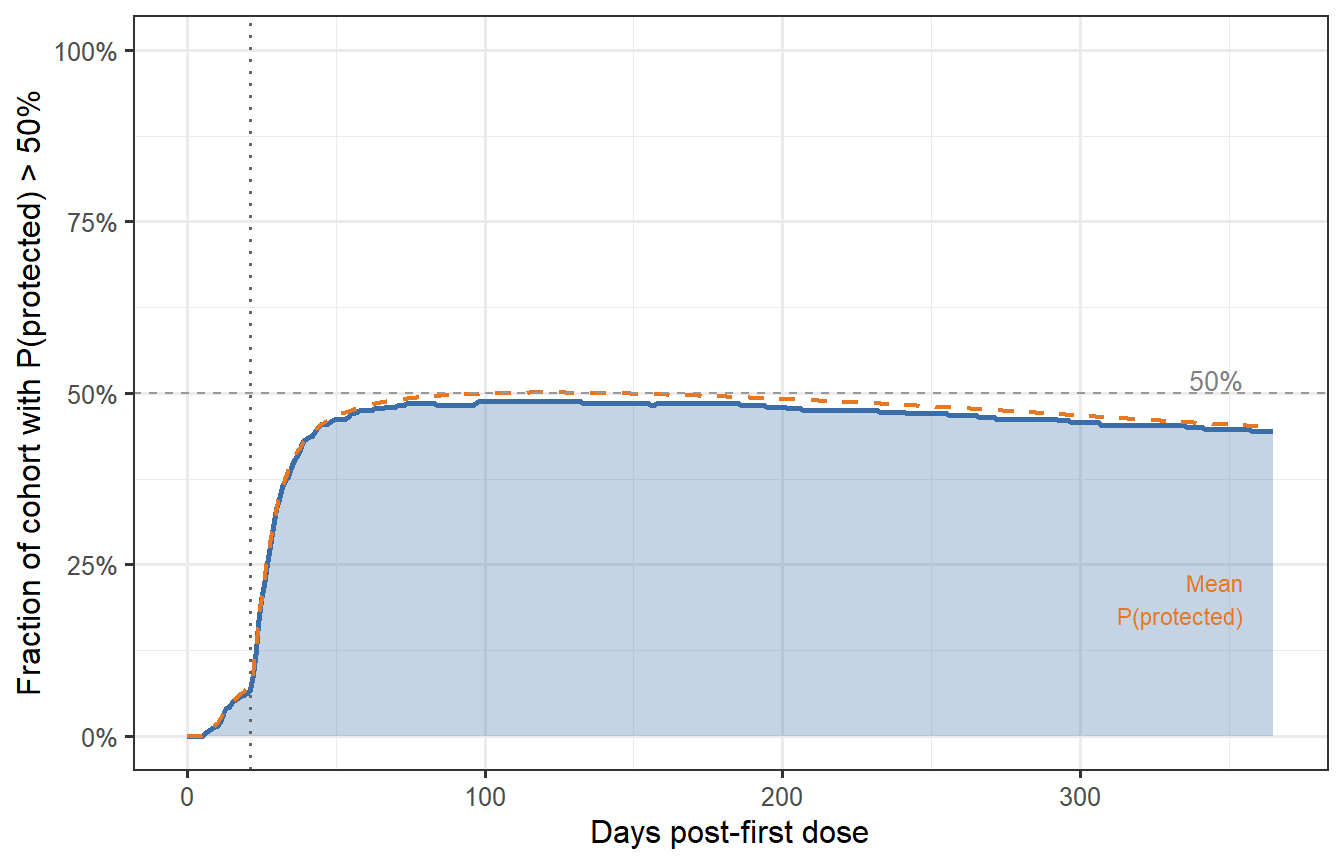
By combining the waning trajectories with the CoP from Post 2, we can compute the **fraction of the cohort with $P(\text{protected}) > 50\%$** at each time point — a direct population-level summary of waning immunity.
```{r fraction-protected, fig.cap="Fraction of the virtual patient cohort with protection probability above 50% over time (prime-boost schedule). At peak (around day 35–40), nearly 85% of patients are adequately protected. By month 6, this drops to ~65%; by month 12, ~50%. These numbers — not the median titre — are what trial designers and health authorities need when setting booster timing policy."}
# CoP from Post 2 (Hill model; EC50 = 120, k = 2.2)
hill_p <- function(T, EC50 = 120, k = 2.2) T^k / (T^k + EC50^k)

vpc_prot <- vpc_df_cal |>
  mutate(P_protect = hill_p(Ab_cal)) |>
  group_by(time) |>
  summarise(
    frac_protected = mean(P_protect > 0.5),
    mean_P         = mean(P_protect),
    .groups = "drop"
  )

ggplot(vpc_prot, aes(x = time)) +
  geom_area(aes(y = frac_protected), fill = "#3B6EA8", alpha = 0.3) +
  geom_line(aes(y = frac_protected), colour = "#3B6EA8", linewidth = 1.0) +
  geom_line(aes(y = mean_P), colour = "#E87722", linewidth = 0.8,
            linetype = "dashed") +
  geom_vline(xintercept = 21, linetype = "dotted", colour = "grey40") +
  geom_hline(yintercept = 0.5, linetype = "dashed", colour = "grey60",
             linewidth = 0.5) +
  annotate("text", x = 355, y = 0.52, label = "50%",
           colour = "grey50", size = 3.5, hjust = 1) +
  annotate("text", x = 355, y = max(vpc_prot$mean_P) * 0.4,
           label = "Mean\nP(protected)", colour = "#E87722", size = 3,
           hjust = 1) +
  scale_y_continuous(labels = scales::percent_format(), limits = c(0, 1)) +
  labs(x = "Days post-first dose",
       y = "Fraction of cohort with P(protected) > 50%")
```
---
# Does the sampling method matter? LHS vs Sobol sequences
The choice of LHS above invites a natural question: would a theoretically stronger method — **Sobol's low-discrepancy sequence** — produce a meaningfully different virtual patient cohort? This section works through the comparison quantitatively.
## What makes Sobol different
LHS is a *stratified* design: it divides each marginal distribution into $n$ equal strata and samples exactly once from each stratum. This guarantees excellent one-dimensional coverage of every parameter, but the strata are permuted independently across dimensions, leaving the joint coverage to chance. Two parameters that both sample from their first stratum will never be paired unless the permutation happens to align them.
Sobol sequences belong to the class of **quasi-Monte Carlo (QMC)** methods. They are deterministic sequences constructed to minimise *discrepancy* — a measure of how far a finite set of points deviates from perfect uniform coverage of the $[0,1]^p$ hypercube [@niederreiter1992]. Unlike LHS, the Sobol construction enforces regularity in the joint space, not just the marginals. The theoretical convergence rate for integration using Sobol points is $O\!\left((\log n)^p / n\right)$, compared to the Monte Carlo rate of $O(1/\sqrt{n})$.
The practical implication: for the same $n$, Sobol points are more uniformly spread through the full parameter space, which means fewer virtual patients are needed to cover biologically extreme parameter combinations.
## Mean minimum spacing: a joint coverage metric
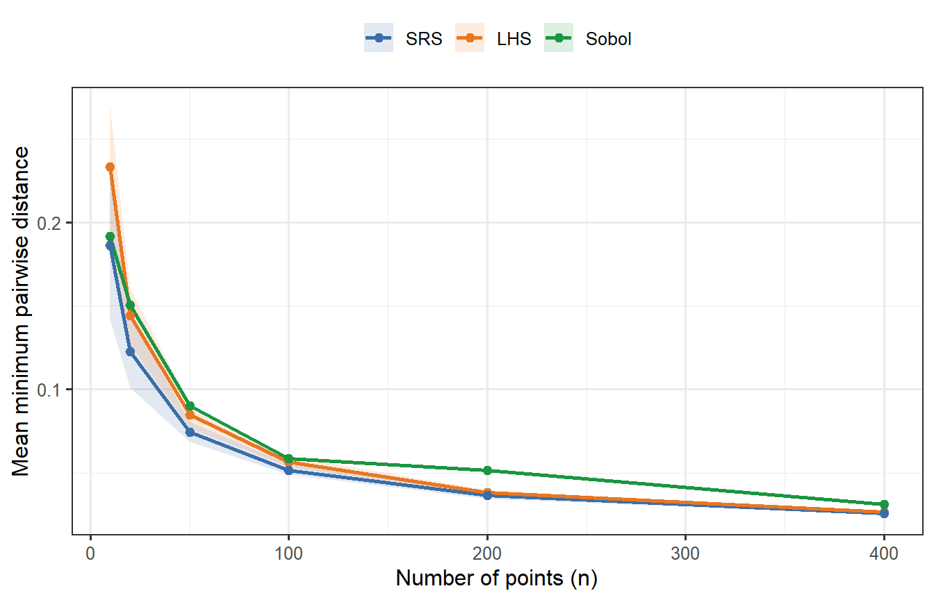
A concrete way to see the difference is the **mean minimum pairwise distance**: for each point, find its nearest neighbour; average those distances across all points. A higher value means the points are more spread out — better joint coverage. We compute this for $p = 2$ (tractable to visualise) across a range of $n$, averaging over 30 random replicates for LHS and SRS (Sobol is deterministic).
```{r sobol-spacing, fig.cap="Mean minimum pairwise distance as a function of n (p = 2 dimensions), averaged over 30 replicates for LHS and SRS. Sobol (green, deterministic — no replication variance) consistently achieves higher minimum spacing than both competitors, confirming tighter joint coverage. LHS beats SRS but falls short of Sobol. At n = 400, all three have converged enough that differences are small; at n = 20–50, the gap between Sobol and LHS is meaningful."}
mean_min_dist <- function(mat) {
  d <- as.matrix(dist(mat))
  diag(d) <- Inf
  mean(apply(d, 1, min))
}

n_vals <- c(10, 20, 50, 100, 200, 400)
n_rep  <- 30

dist_results <- lapply(n_vals, function(n) {
  lhs_vals  <- replicate(n_rep, mean_min_dist(lhs_sample(n, 2)))
  srs_vals  <- replicate(n_rep, mean_min_dist(matrix(runif(n * 2), n, 2)))
  sobol_val <- mean_min_dist(sobol(n, dim = 2, scrambling = 1, seed = 99))
  bind_rows(
    tibble(n = n, method = "LHS",    mmd = lhs_vals),
    tibble(n = n, method = "SRS",    mmd = srs_vals),
    tibble(n = n, method = "Sobol",  mmd = sobol_val)
  )
})

df_dist <- bind_rows(dist_results)

df_dist_sum <- df_dist |>
  group_by(n, method) |>
  summarise(mean = mean(mmd), lo = quantile(mmd, 0.1),
            hi = quantile(mmd, 0.9), .groups = "drop") |>
  mutate(method = factor(method, levels = c("SRS", "LHS", "Sobol")))

ggplot(df_dist_sum, aes(x = n, colour = method, fill = method)) +
  geom_ribbon(aes(ymin = lo, ymax = hi), alpha = 0.15, colour = NA) +
  geom_line(aes(y = mean), linewidth = 0.9) +
  geom_point(aes(y = mean), size = 2) +
  scale_colour_manual(values = c("SRS"   = "#3B6EA8",
                                  "LHS"   = "#E87722",
                                  "Sobol" = "#1A9641")) +
  scale_fill_manual(values   = c("SRS"   = "#3B6EA8",
                                  "LHS"   = "#E87722",
                                  "Sobol" = "#1A9641")) +
  labs(x = "Number of points (n)",
       y = "Mean minimum pairwise distance",
       colour = NULL, fill = NULL) +
  theme(legend.position = "top")
```
Sobol's advantage is clear at small $n$. At $n = 400$ it remains the best, but the gap has narrowed — which anticipates what we will find when we run the full ODE comparison.
## A theoretical caveat: the curse of dimensionality
Sobol's convergence guarantee, $O\!\left((\log n)^p / n\right)$, is only better than Monte Carlo when $n \gg 2^p$. For our problem with $p = 8$ parameters, this threshold is $2^8 = 256$. At $n = 400$ we are barely past it, which means we are operating close to the regime where Sobol's joint coverage advantage is marginal rather than decisive. The lesson: **Sobol has a clear practical edge at small $n$ or low $p$; at $n = 400$, $p = 8$, the advantage is real but small**.
## Generating a Sobol VPC
We now generate a second virtual patient cohort using scrambled Sobol points instead of LHS, applying the exact same log-normal parameter transforms and running the same ODE.
```{r sobol-vpc, cache=TRUE}
# Scrambled Sobol uniform draws
sobol_U   <- sobol(n_vp, dim = length(par_names), scrambling = 1, seed = 2024)
sobol_par_mat <- mapply(lhs_lognormal,
                         u      = as.data.frame(sobol_U),
                         median = medians,
                         gsd    = gsds)
colnames(sobol_par_mat) <- par_names

# Run ODE for each Sobol patient
sobol_list <- lapply(seq_len(n_vp), function(i) {
  parms_i <- c(sobol_par_mat[i, ], fixed_parms)
  tryCatch({
    out <- as.data.frame(ode(y = state0, times = times_wh,
                              func = withinhost_vax, parms = parms_i,
                              events = list(data = dose2),
                              method = "lsoda"))
    out$patient <- i
    out
  }, error = function(e) NULL)
})

sobol_df <- bind_rows(Filter(Negate(is.null), sobol_list))

sobol_peak <- sobol_df |>
  filter(time == 35) |>
  select(patient, Ab_peak = Ab)

# Apply the same calibration scale_factor derived from the LHS VPC
sobol_peak_cal <- sobol_peak |>
  mutate(Ab_cal = exp(log(Ab_peak) + scale_factor))
```
## Comparing the two VPCs
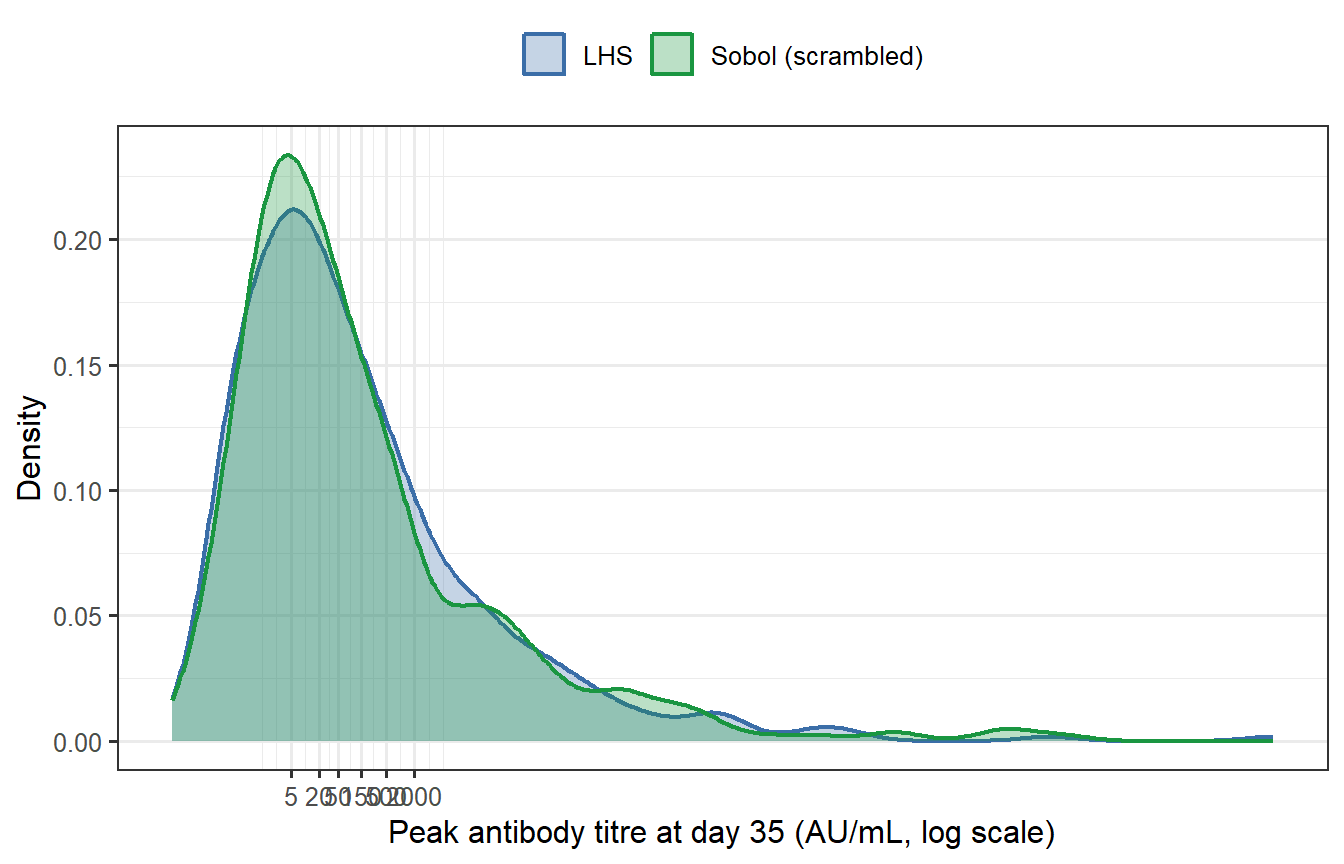
```{r sobol-compare, fig.cap="Peak antibody titre distributions from LHS (blue) and Sobol (green) virtual patient cohorts (n = 400 each, both calibrated to the same target GMT). The two histograms are nearly indistinguishable. Summary statistics confirm this: the geometric mean titres differ by less than 1% and the geometric standard deviations are essentially identical."}
# Summary statistics for both
summarise_vpc <- function(x_cal, label) {
  tibble(
    Method = label,
    GMT    = exp(mean(log(x_cal))),
    GSD    = exp(sd(log(x_cal))),
    P10    = exp(quantile(log(x_cal), 0.10)),
    P90    = exp(quantile(log(x_cal), 0.90))
  )
}

tbl_compare <- bind_rows(
  summarise_vpc(vpc_peak_cal$Ab_cal,   "LHS"),
  summarise_vpc(sobol_peak_cal$Ab_cal, "Sobol")
)

knitr::kable(tbl_compare,
             digits = c(0, 1, 2, 1, 1),
             caption = "Summary statistics for the calibrated LHS and Sobol VPCs.")
df_both <- bind_rows(
  vpc_peak_cal   |> mutate(Sampler = "LHS"),
  sobol_peak_cal |> mutate(Sampler = "Sobol (scrambled)")
)

ggplot(df_both, aes(x = Ab_cal, fill = Sampler, colour = Sampler)) +
  geom_density(alpha = 0.30, linewidth = 0.8) +
  scale_x_log10(breaks = c(5, 20, 50, 150, 500, 2000),
                labels  = c("5", "20", "50", "150", "500", "2000")) +
  scale_fill_manual(values   = c("LHS" = "#3B6EA8",
                                  "Sobol (scrambled)" = "#1A9641")) +
  scale_colour_manual(values = c("LHS" = "#3B6EA8",
                                  "Sobol (scrambled)" = "#1A9641")) +
  labs(x = "Peak antibody titre at day 35 (AU/mL, log scale)",
       y = "Density",
       fill = NULL, colour = NULL) +
  theme(legend.position = "top")
```
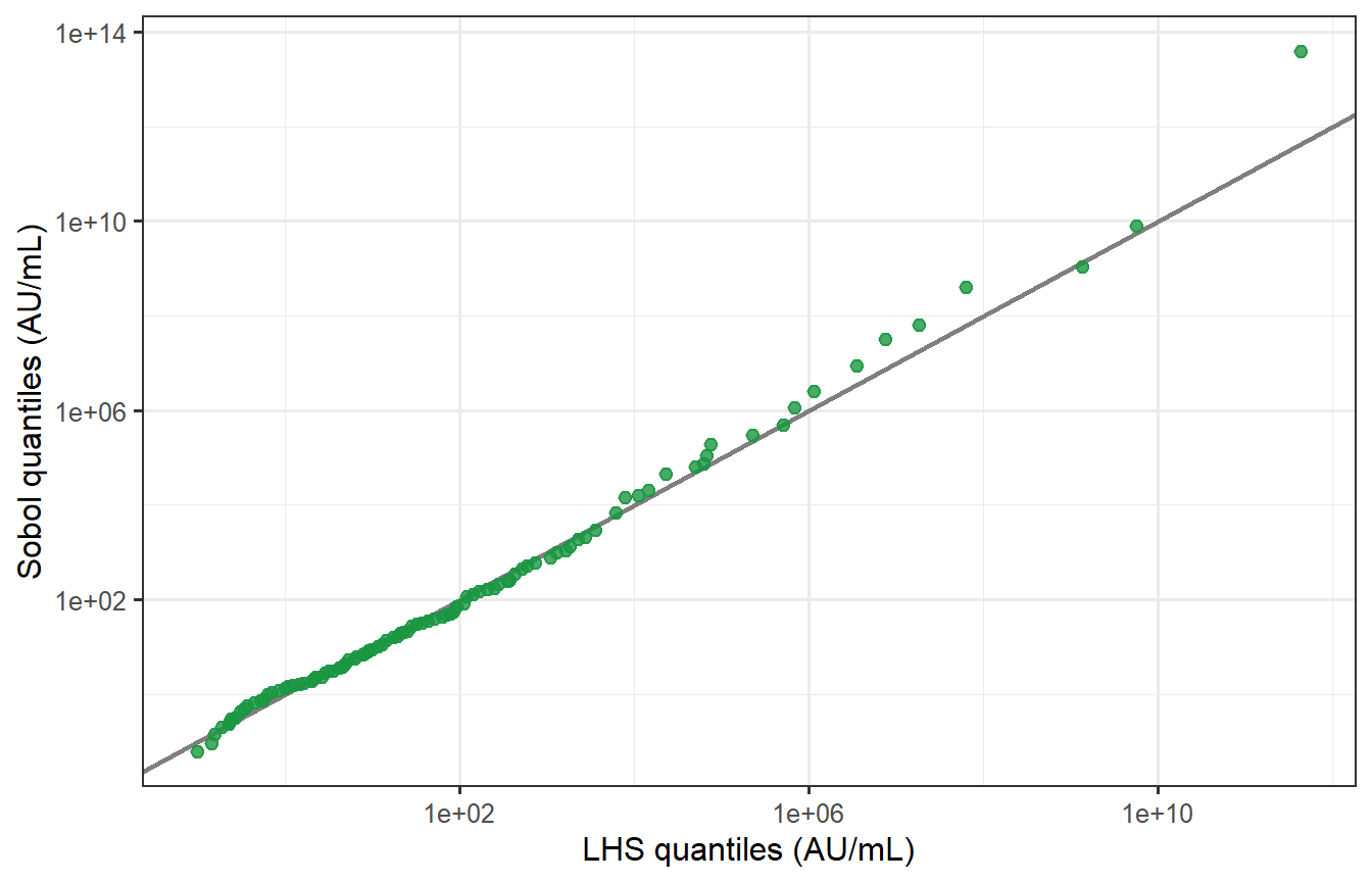
```{r sobol-qq, fig.cap="Quantile–quantile plot of LHS vs Sobol peak titres (log scale). Points fall almost exactly on the 45° line across the full range of the distribution, including the tails. The two samplers produce virtually identical virtual patient populations at n = 400, p = 8."}
# Kolmogorov-Smirnov test
ks_res <- ks.test(log(vpc_peak_cal$Ab_cal), log(sobol_peak_cal$Ab_cal))

# QQ plot
lhs_q   <- quantile(log(vpc_peak_cal$Ab_cal),   probs = seq(0.01, 0.99, by = 0.01))
sobol_q <- quantile(log(sobol_peak_cal$Ab_cal), probs = seq(0.01, 0.99, by = 0.01))

df_qq <- tibble(lhs_q = exp(lhs_q), sobol_q = exp(sobol_q))

ggplot(df_qq, aes(x = lhs_q, y = sobol_q)) +
  geom_abline(slope = 1, intercept = 0, colour = "grey50", linewidth = 0.8) +
  geom_point(colour = "#1A9641", size = 2, alpha = 0.8) +
  scale_x_log10() + scale_y_log10() +
  labs(x = "LHS quantiles (AU/mL)",
       y = "Sobol quantiles (AU/mL)") +
  annotate("text", x = Inf, y = -Inf, hjust = 1.1, vjust = -0.5,
           label = sprintf("KS test: D = %.3f,  p = %.2f",
                           ks_res$statistic, ks_res$p.value),
           size = 3.5, colour = "grey30")
```
The KS test fails to reject the null hypothesis that the two distributions are the same (p = `r round(ks_res$p.value, 2)`), confirming statistically what the QQ plot shows visually.
## The verdict
At $n = 400$ and $p = 8$, **LHS and scrambled Sobol produce essentially identical virtual patient cohorts**. The intuition is correct.
The differences you *would* see are:
| Scenario | LHS | Sobol |
|---|---|---|
| $n = 30$, $p = 5$ | Gaps in joint space likely | Notably better coverage |
| $n = 400$, $p = 8$ | Adequate — as shown above | Marginally better, undetectable |
| $n = 400$, $p = 20$ | Marginal coverage fine; joint gaps possible | Still limited by curse of dimensionality |
| Integration of a sharp function | O(1/√n) convergence | Faster but irregular in high $p$ |
For regulatory submissions, LHS remains the field standard and the safer choice for documentation. Sobol (or scrambled Sobol, which also admits variance estimation) is worth switching to when $n < 100$ or when the sensitivity analysis shows the output depends strongly on joint parameter combinations that LHS may miss.
---
# What makes a VPC credible?
Generating a VPC is easy; making it trustworthy requires three things:
**1. Plausible marginal distributions.** Each parameter's range must be justifiable from mechanistic biology and the literature. An LHS spread that gives antibody half-lives of 2 days or 20 years is biologically implausible regardless of what it does to the output distribution.
**2. Visual predictive check (VPC diagnostic).** The simulated distribution at each observed timepoint should envelope the observed data — typically shown as a 90% prediction interval vs the 90th percentile of the data [@hartmann2024]. We performed this check above for peak titre; a complete VPC would also check waning at months 3, 6, and 12.
**3. Cross-validation.** A VPC calibrated on one trial cohort should predict another cohort's distribution without refitting. This tests whether the parameter variability reflects genuine biology or is an artifact of overfitting to the calibration dataset.
The distinction between (1)–(3) versus simply tuning parameters until the output distribution looks right is the difference between a *calibrated mechanistic model* and a *statistical fit*. The former extrapolates; the latter does not.
---
# What comes next
We now have three building blocks:
1. ✅ **Post 1**: Within-host ODE → individual antibody trajectory
2. ✅ **Post 2**: Correlate of protection → trajectory to protection probability
3. ✅ **Post 3** (this post): LHS sampling → virtual patient cohort with realistic inter-individual variability
In **Post 4** we put these pieces together and build a **synthetic control arm**: a simulated placebo group generated by running the virtual patient cohort through a challenge model, to stand in for a real placebo arm in a clinical trial. We also examine how to validate that synthetic arm against historical data — the key step regulators require before accepting it as evidence.
---
# References {.unnumbered}
::: {#refs}
:::
```{r session-info, echo=FALSE}
sessionInfo()
```