Outbreak Simulation: Pre-emptive vs. Reactive Vaccination
Author
Jong-Hoon Kim
Published
June 28, 2025
When managing infectious disease risks such as cholera, limited vaccine supply often forces decision-makers to choose between pre-emptive and reactive vaccination campaigns. This post explores a cost-benefit model comparing the two strategies using analytical expressions and numerical simulations.
We aim to answer: Under what conditions is it better to vaccinate before an outbreak occurs, and when is it more beneficial to wait and respond reactively?
1 Defining the Core Quantities
Let:
\(B\): The full benefit gained by averting an outbreak (e.g., DALYs or cases averted)
\(C\): The cost of deploying one vaccination campaign
\(p\): The probability of an outbreak in a given region
\(r\): The effectiveness of a reactive campaign relative to pre-emptive one (e.g., \(r=0.6\) means 60% as effective)
1.1 Pre-emptive Vaccination
If we vaccinate before any outbreak, the expected benefit is \(B \cdot p\). However, we always incur the campaign cost \(C\), so the net expected benefit is:
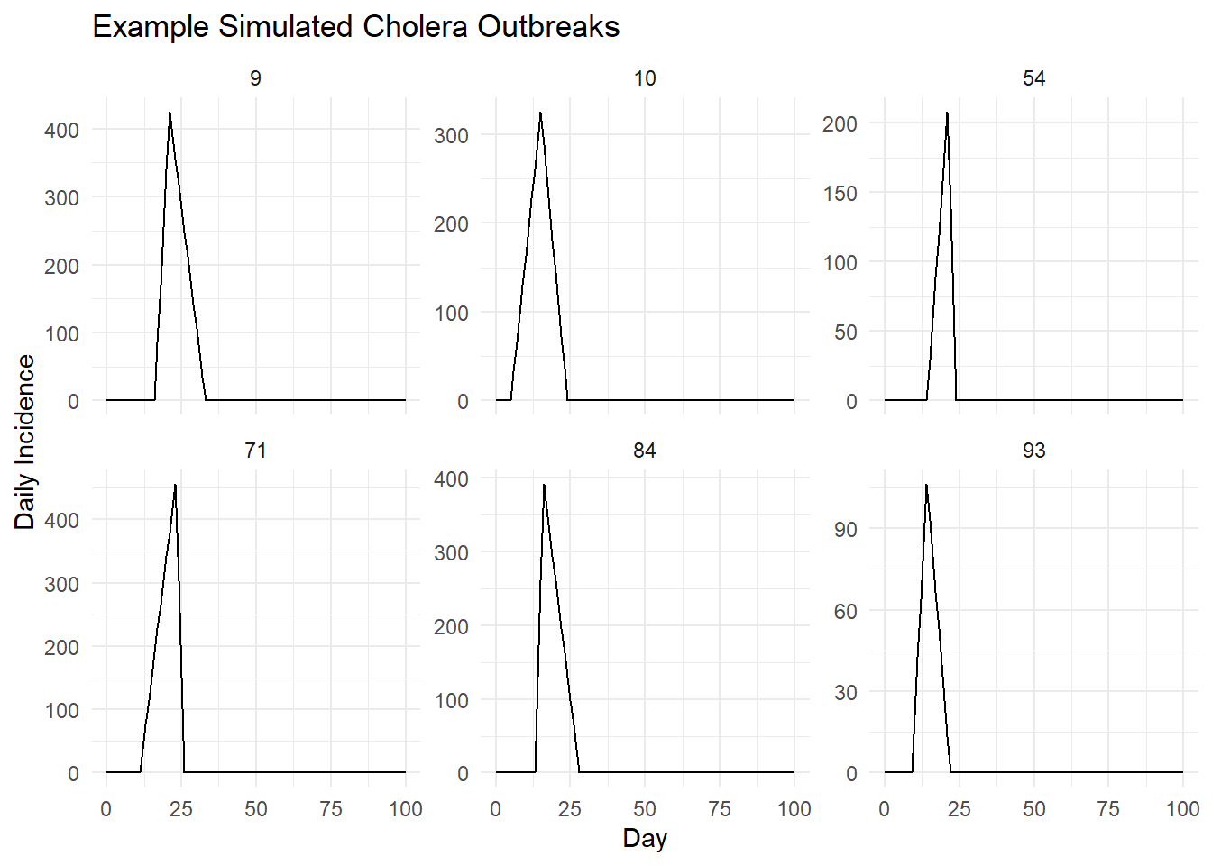
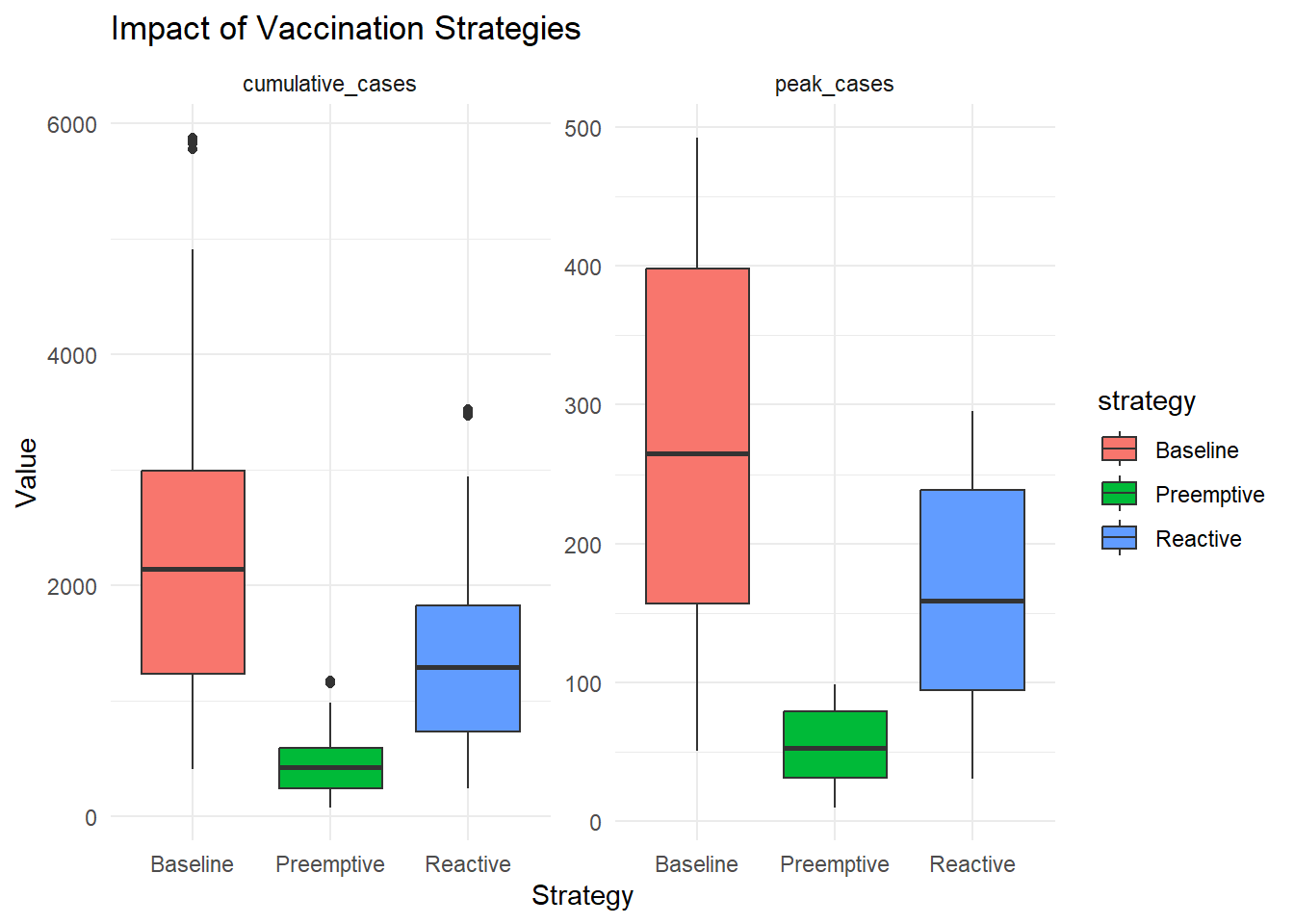
Code
# Cholera Outbreak Simulation Using Piecewise Linear Curves (Inspired by Middleton et al.)library(tidyverse)library(ggplot2)# --- Parameters ---n_sim <-100# number of outbreaksdays <-0:100# time horizon (days)preemptive_reduction <-0.8# percent reduction in peak and total for preemptive vaccinereactive_reduction <-0.4# percent reduction in post-day-7 values for reactive vaccinereactive_delay <-7# Function to generate piecewise linear outbreaksimulate_outbreak <-function(start_day, peak_day, end_day, peak_height) {tibble(day = days,incidence =case_when( day < start_day ~0, day >= start_day & day < peak_day ~ (day - start_day) / (peak_day - start_day) * peak_height, day >= peak_day & day <= end_day ~ (end_day - day) / (end_day - peak_day) * peak_height,TRUE~0 ) )}# Function to apply preemptive vaccinationapply_preemptive <-function(incidence, reduction) { incidence * (1- reduction)}# Function to apply reactive vaccinationapply_reactive <-function(df, reduction, delay) { df %>%mutate(incidence =ifelse(day > delay, incidence * (1- reduction), incidence) )}# --- Simulate all outbreaks ---set.seed(42)outbreaks <-vector("list", n_sim)for (i in1:n_sim) { start_day <-sample(5:20, 1) duration <-sample(10:25, 1) peak_offset <-sample(3:(duration -3), 1) peak_day <- start_day + peak_offset end_day <- start_day + duration peak_height <-runif(1, 50, 500) df <-simulate_outbreak(start_day, peak_day, end_day, peak_height) df <- df %>%mutate(sim_id = i) outbreaks[[i]] <- df}all_outbreaks <-bind_rows(outbreaks)# Apply strategiespreemptive <- all_outbreaks %>%group_by(sim_id) %>%mutate(incidence =apply_preemptive(incidence, preemptive_reduction))reactive <- all_outbreaks %>%group_by(sim_id) %>%group_modify(~apply_reactive(.x, reactive_reduction, reactive_delay))# --- Summarize ---summarize_scenarios <-function(df) { df %>%group_by(sim_id) %>%summarise(cumulative_cases =sum(incidence),peak_cases =max(incidence) )}baseline_summary <-summarize_scenarios(all_outbreaks)preemptive_summary <-summarize_scenarios(preemptive)reactive_summary <-summarize_scenarios(reactive)# Combine for comparisoncomparison <-bind_rows( baseline_summary %>%mutate(strategy ="Baseline"), preemptive_summary %>%mutate(strategy ="Preemptive"), reactive_summary %>%mutate(strategy ="Reactive"))# --- Visualization ---# Plot a few example outbreaksexample_ids <-sample(1:n_sim, 6)example_data <- all_outbreaks %>%filter(sim_id %in% example_ids)example_plot <- example_data %>%ggplot(aes(x = day, y = incidence)) +geom_line() +facet_wrap(~ sim_id, scales ="free_y") +theme_minimal() +labs(title ="Example Simulated Cholera Outbreaks",x ="Day", y ="Daily Incidence")# Boxplots of cumulative cases and peak by strategyboxplot_plot <- comparison %>%pivot_longer(cols =c(cumulative_cases, peak_cases), names_to ="metric", values_to ="value") %>%ggplot(aes(x = strategy, y = value, fill = strategy)) +geom_boxplot() +facet_wrap(~ metric, scales ="free_y") +theme_minimal() +labs(title ="Impact of Vaccination Strategies", y ="Value", x ="Strategy")# Display plotsprint(example_plot)