When we study multiple stock prices together, one of the first questions is: do they move together, and if so, by how much and with what delay? Cross-correlation answers exactly this.
Cross-correlation measures the similarity between two time series as a function of a lag applied to one of them. Unlike a simple correlation coefficient (which is a single number), cross-correlation gives us a function that reveals:
How strongly two stocks co-move
Whether one leads the other (a lag > 0 suggests stock A today predicts stock B tomorrow)
How persistent that relationship is over time
This post covers cross-correlation from first principles, applied to real Korean stock data.
2 Setup
Code
# Install if needed:# pip install FinanceDataReader pandas numpy matplotlib seaborn scipy statsmodelsimport FinanceDataReader as fdrimport pandas as pdimport numpy as npimport matplotlib.pyplot as pltimport matplotlib.dates as mdatesimport seaborn as snsfrom scipy import statsfrom statsmodels.tsa.stattools import ccf as sm_ccffrom statsmodels.tsa.stattools import grangercausalitytestsplt.rcParams['figure.dpi'] =120plt.rcParams['font.size'] =11sns.set_theme(style='whitegrid')
3 1. Downloading Korean Stock Data
We use FinanceDataReader, which supports KOSPI and KOSDAQ natively.
Code
# Major Korean blue-chip stockstickers = {'005930': 'Samsung Electronics','000660': 'SK Hynix','035420': 'NAVER','035720': 'Kakao','005380': 'Hyundai Motor','005490': 'POSCO','105560': 'KB Financial','000270': 'Kia',}start ='2018-01-01'end ='2024-12-31'prices = {}for ticker, name in tickers.items(): df = fdr.DataReader(ticker, start, end) prices[name] = df['Close']prices = pd.DataFrame(prices)prices.index = pd.to_datetime(prices.index)prices = prices.dropna()print(f"Shape: {prices.shape}")print(f"Period: {prices.index[0].date()} to {prices.index[-1].date()}")prices.head()
Shape: (1721, 8)
Period: 2018-01-02 to 2024-12-30
Samsung Electronics
SK Hynix
NAVER
Kakao
Hyundai Motor
POSCO
KB Financial
Kia
Date
2018-01-02
51020
76600
177251
29405
149500
339000
63100
32800
2018-01-03
51620
77700
174447
29906
150500
357500
63100
32600
2018-01-04
51080
77100
178853
31311
146500
367500
63000
31550
2018-01-05
52120
79300
181857
31311
149000
368000
64100
31950
2018-01-08
52020
78200
190269
32014
151000
369500
66600
32400
4 2. Exploratory Data Analysis
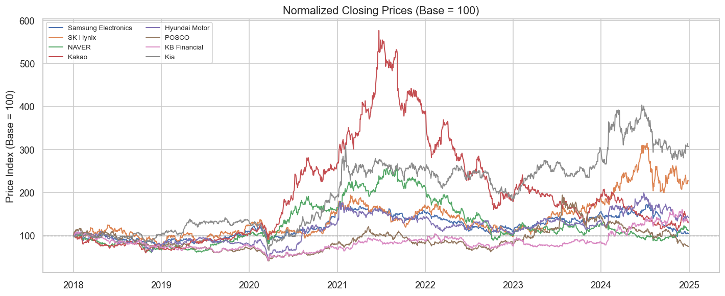
4.1 2.1 Normalized Price Trajectories
Raw prices have very different scales. We normalize to 100 at the start to compare trajectories.
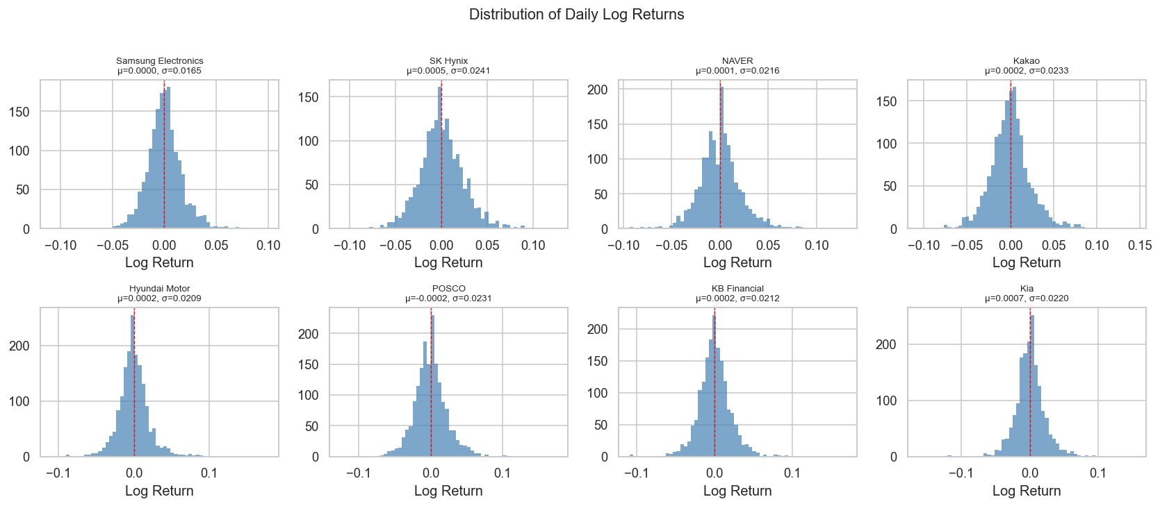
Interpretation note: Stock returns are almost never normal. Excess kurtosis > 0 (“fat tails”) means extreme moves are more common than a normal distribution predicts. The Jarque-Bera test formalizes this: p-value < 0.05 rejects normality.
5 3. Cross-Correlation: Theory
5.1 3.1 Pearson Correlation (Lag = 0)
The familiar correlation coefficient between two return series \(X\) and \(Y\) is:
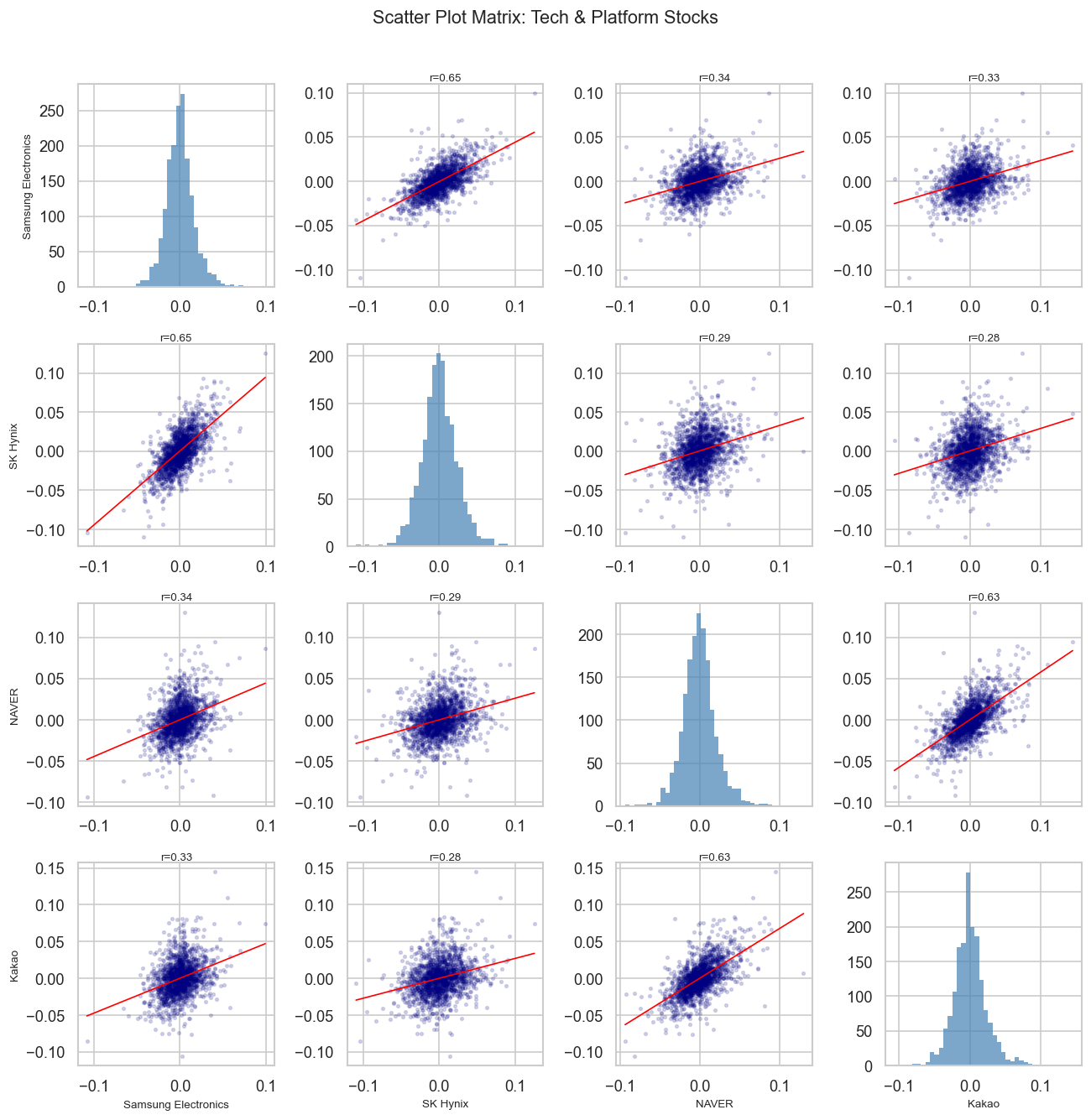
selected = ['Samsung Electronics', 'SK Hynix', 'NAVER', 'Kakao']sub = returns[selected]fig, axes = plt.subplots(4, 4, figsize=(11, 11))for i, col_i inenumerate(selected):for j, col_j inenumerate(selected): ax = axes[i][j]if i == j: ax.hist(sub[col_i], bins=40, color='steelblue', alpha=0.7, edgecolor='none') ax.set_xlabel(col_i if i ==3else'')else: x, y = sub[col_j], sub[col_i] ax.scatter(x, y, alpha=0.15, s=5, color='navy')# regression line m, b, r, p, _ = stats.linregress(x, y) xr = np.linspace(x.min(), x.max(), 100) ax.plot(xr, m * xr + b, color='red', linewidth=1) ax.set_title(f'r={r:.2f}', fontsize=8, pad=2)if j ==0: ax.set_ylabel(col_i, fontsize=8)if i ==3: ax.set_xlabel(col_j, fontsize=8)plt.suptitle('Scatter Plot Matrix: Tech & Platform Stocks', fontsize=13, y=1.01)plt.tight_layout()plt.show()
7 5. Cross-Correlation Function (CCF)
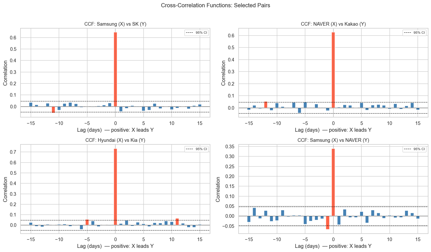
The CCF tells us whether one stock leads or lags another. This is crucial for understanding information flow in markets.
7.1 5.1 CCF for a Single Pair
Code
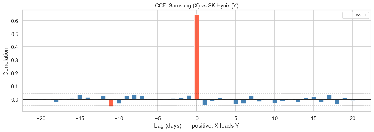
def plot_ccf(x, y, name_x, name_y, max_lag=30, ax=None):"""Plot cross-correlation function with confidence bounds."""if ax isNone: fig, ax = plt.subplots(figsize=(10, 4)) n =len(x) conf =1.96/ np.sqrt(n) lags = np.arange(-max_lag, max_lag +1) ccf_vals = []for lag in lags:if lag ==0: ccf_vals.append(np.corrcoef(x, y)[0, 1])elif lag >0: ccf_vals.append(np.corrcoef(x[:-lag], y[lag:])[0, 1])else: ccf_vals.append(np.corrcoef(x[-lag:], y[:lag])[0, 1]) colors = ['tomato'ifabs(v) > conf else'steelblue'for v in ccf_vals] ax.bar(lags, ccf_vals, color=colors, width=0.6) ax.axhline(conf, color='black', linestyle='--', linewidth=0.8, label='95% CI') ax.axhline(-conf, color='black', linestyle='--', linewidth=0.8) ax.axhline(0, color='black', linewidth=0.5) ax.axvline(0, color='gray', linewidth=0.8, linestyle=':') ax.set_xlabel('Lag (days) — positive: X leads Y') ax.set_ylabel('Correlation') ax.set_title(f'CCF: {name_x} (X) vs {name_y} (Y)', fontsize=11) ax.legend(fontsize=8)return ccf_vals, lagsx = returns['Samsung Electronics'].valuesy = returns['SK Hynix'].valuesfig, ax = plt.subplots(figsize=(11, 4))plot_ccf(x, y, 'Samsung', 'SK Hynix', max_lag=20, ax=ax)plt.tight_layout()plt.show()
Reading the CCF plot: Red bars exceed the 95% confidence band — these lags show statistically significant correlation. A positive lag means Samsung today predicts SK Hynix in lag days.
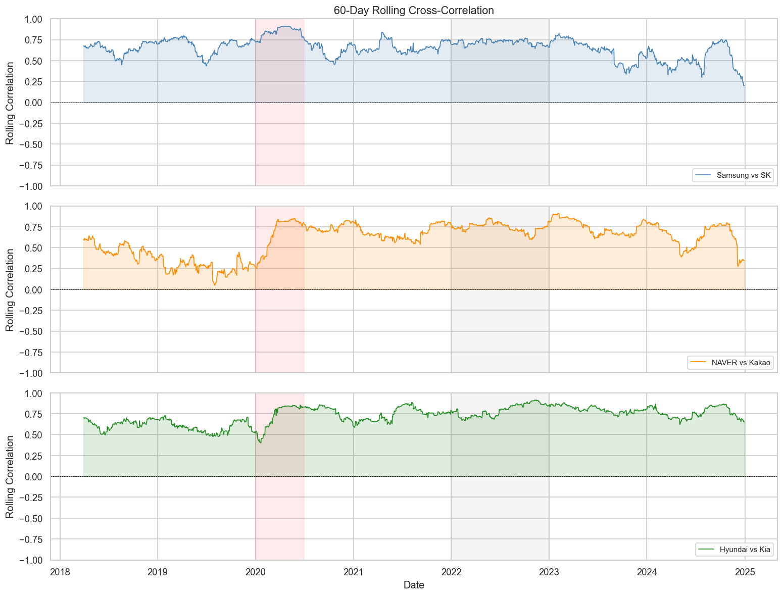
The correlation between stocks is not stable over time — it changes with market regimes (bull, bear, crisis). Rolling correlation captures this dynamics.
Key insight: Correlations spike toward 1.0 during market crises (COVID-19 crash in early 2020). This is the “correlation breakdown” problem — diversification fails precisely when you need it most.
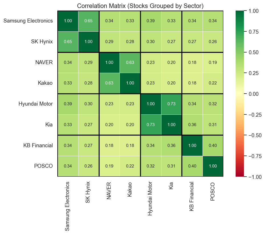
9 7. Sector-Level Analysis
9.1 7.1 Average Within-Sector vs. Cross-Sector Correlation
Code
sectors = {'Tech/Semi': ['Samsung Electronics', 'SK Hynix'],'Platform': ['NAVER', 'Kakao'],'Auto': ['Hyundai Motor', 'Kia'],'Finance/Industry': ['KB Financial', 'POSCO'],}# Build sector label for each stockstock_sector = {}for sector, stocks in sectors.items():for s in stocks: stock_sector[s] = sector# Annotated heatmap with sector groupingsordered_stocks = [s for sector in sectors.values() for s in sector]corr_ordered = returns[ordered_stocks].corr()fig, ax = plt.subplots(figsize=(9, 7))sns.heatmap( corr_ordered, annot=True, fmt='.2f', cmap='RdYlGn', vmin=-1, vmax=1, center=0, square=True, linewidths=0.5, ax=ax, annot_kws={'size': 9},)# Draw sector boundariesboundaries = [0, 2, 4, 6, 8]for b in boundaries: ax.axhline(b, color='black', linewidth=2) ax.axvline(b, color='black', linewidth=2)ax.set_title('Correlation Matrix (Stocks Grouped by Sector)', fontsize=13)plt.tight_layout()plt.show()
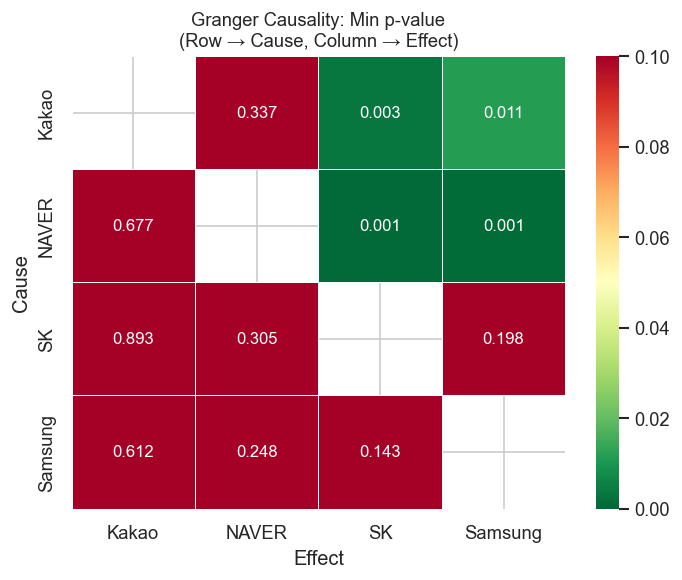
10 8. Granger Causality
Granger causality tests whether past values of stock X help predict stock Y, beyond what Y’s own past predicts. It is not causality in a strict sense — it’s predictive precedence.
Null hypothesis: X does not Granger-cause Y
Code
def granger_table(returns_df, stocks, max_lag=5):"""Return a DataFrame of Granger causality p-values.""" results = []for cause in stocks:for effect in stocks:if cause == effect:continue data = returns_df[[effect, cause]].dropna() test = grangercausalitytests(data, maxlag=max_lag, verbose=False)# use minimum p-value across lags (F-test) min_p =min(test[lag][0]['ssr_ftest'][1] for lag inrange(1, max_lag +1)) best_lag =min(range(1, max_lag +1), key=lambda l: test[l][0]['ssr_ftest'][1]) results.append({'Cause': cause.split()[0],'Effect': effect.split()[0],'Min p-value': round(min_p, 4),'Best lag': best_lag,'Significant': 'Yes'if min_p <0.05else'No', })return pd.DataFrame(results)selected_stocks = ['Samsung Electronics', 'SK Hynix', 'NAVER', 'Kakao']granger_df = granger_table(returns, selected_stocks, max_lag=5)granger_df.sort_values('Min p-value')
Cause
Effect
Min p-value
Best lag
Significant
7
NAVER
SK
0.0007
3
Yes
6
NAVER
Samsung
0.0011
1
Yes
10
Kakao
SK
0.0034
1
Yes
9
Kakao
Samsung
0.0114
1
Yes
0
Samsung
SK
0.1435
1
No
3
SK
Samsung
0.1975
2
No
1
Samsung
NAVER
0.2485
2
No
4
SK
NAVER
0.3046
2
No
11
Kakao
NAVER
0.3373
5
No
2
Samsung
Kakao
0.6116
3
No
8
NAVER
Kakao
0.6770
1
No
5
SK
Kakao
0.8934
1
No
Code
# Visualize as a heatmap of p-valuespivot = granger_df.pivot(index='Cause', columns='Effect', values='Min p-value')fig, ax = plt.subplots(figsize=(6, 5))sns.heatmap( pivot, annot=True, fmt='.3f', cmap='RdYlGn_r', # red = low p-value = significant vmin=0, vmax=0.1, linewidths=0.5, ax=ax, annot_kws={'size': 10},)ax.set_title('Granger Causality: Min p-value\n(Row → Cause, Column → Effect)', fontsize=11)plt.tight_layout()plt.show()
Caution: Granger causality in daily stock returns is hard to find due to market efficiency. Significant results are more common in intraday data or between related instruments (ETFs and their underlying stocks).
11 9. Key Takeaways
Concept
What it measures
Limitation
Pearson correlation
Co-movement at lag 0
Static; hides time dynamics
Cross-correlation function (CCF)
Co-movement at all lags
Assumes stationarity
Rolling correlation
Time-varying co-movement
Window choice is arbitrary
Granger causality
Predictive precedence
Not structural causation
Empirical findings for Korean blue chips (2018–2024):
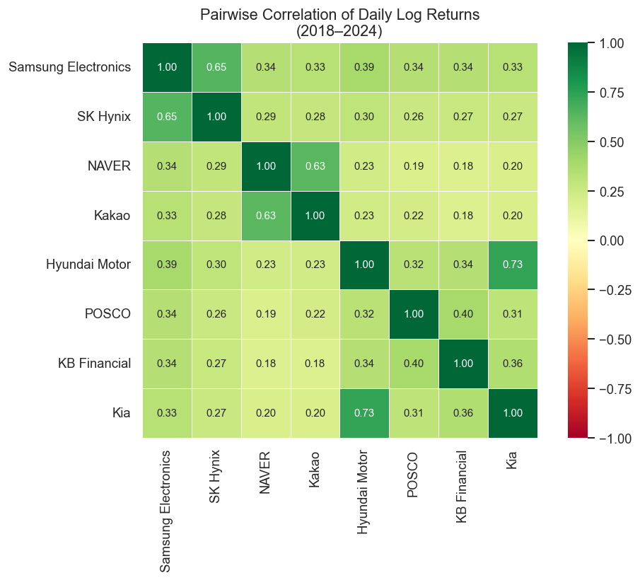
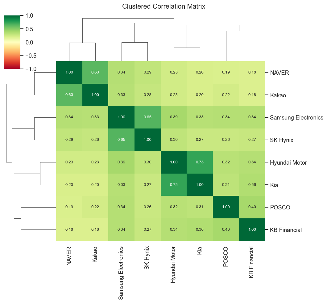
Intra-sector correlations are high: Samsung–SK Hynix (semiconductors) and Hyundai–Kia (auto) move closely together, reflecting shared business cycles and news.
Tech platform stocks (NAVER, Kakao) are moderately correlated but diverge more than the hardware pairs.
Crisis periods compress all correlations toward 1 — the diversification benefit collapses exactly when markets fall.
Lag effects are generally weak in daily data — consistent with the efficient market hypothesis.
Rolling correlations are highly non-stationary — a static correlation matrix is a snapshot, not a permanent property.
12 Next Steps
Volatility cross-correlation: Do volatility spikes (GARCH residuals) spread across stocks faster than return co-movements?
High-frequency data: Lead-lag effects are much stronger at 1–5 minute intervals
Copulas: Model non-linear tail dependence beyond linear correlation
Network analysis: Build a correlation network graph and detect communities
13 References
Campbell, J. Y., Lo, A. W., & MacKinlay, A. C. (1997). The Econometrics of Financial Markets. Princeton University Press.
Cont, R. (2001). Empirical properties of asset returns: stylized facts and statistical issues. Quantitative Finance, 1(2), 223–236.
Granger, C. W. J. (1969). Investigating causal relations by econometric models and cross-spectral methods. Econometrica, 37(3), 424–438.